
Updated:
October 25, 2025
Published:
July 7, 2025
What is Responsive Design? Modern Web Design Guide
Responsive design plays a central role in modern web development today. Websites must adapt flexibly to different screen sizes so that content is displayed optimally regardless of the device. Whether it's a smartphone, tablet or classic desktop — users expect a layout that automatically adapts to the respective resolution and offers a high level of usability.
The increasing mobile use of websites has reinforced this requirement. More and more access is being made via smartphones or tablets, which have smaller displays and varying pixel densities. Without a well-thought-out responsive web design, companies risk not only poor presentation, but also a noticeable loss of reach, interactions and potential customers.
Technically, responsive design is based primarily on CSS and HTML in combination with so-called media queries. These control how the layout dynamically changes depending on the screen width, resolution, or device. When implemented correctly, responsive design ensures that websites work optimally everywhere and thus noticeably improve both user experience and business performance.
What is responsive design actually — flexible for every device?
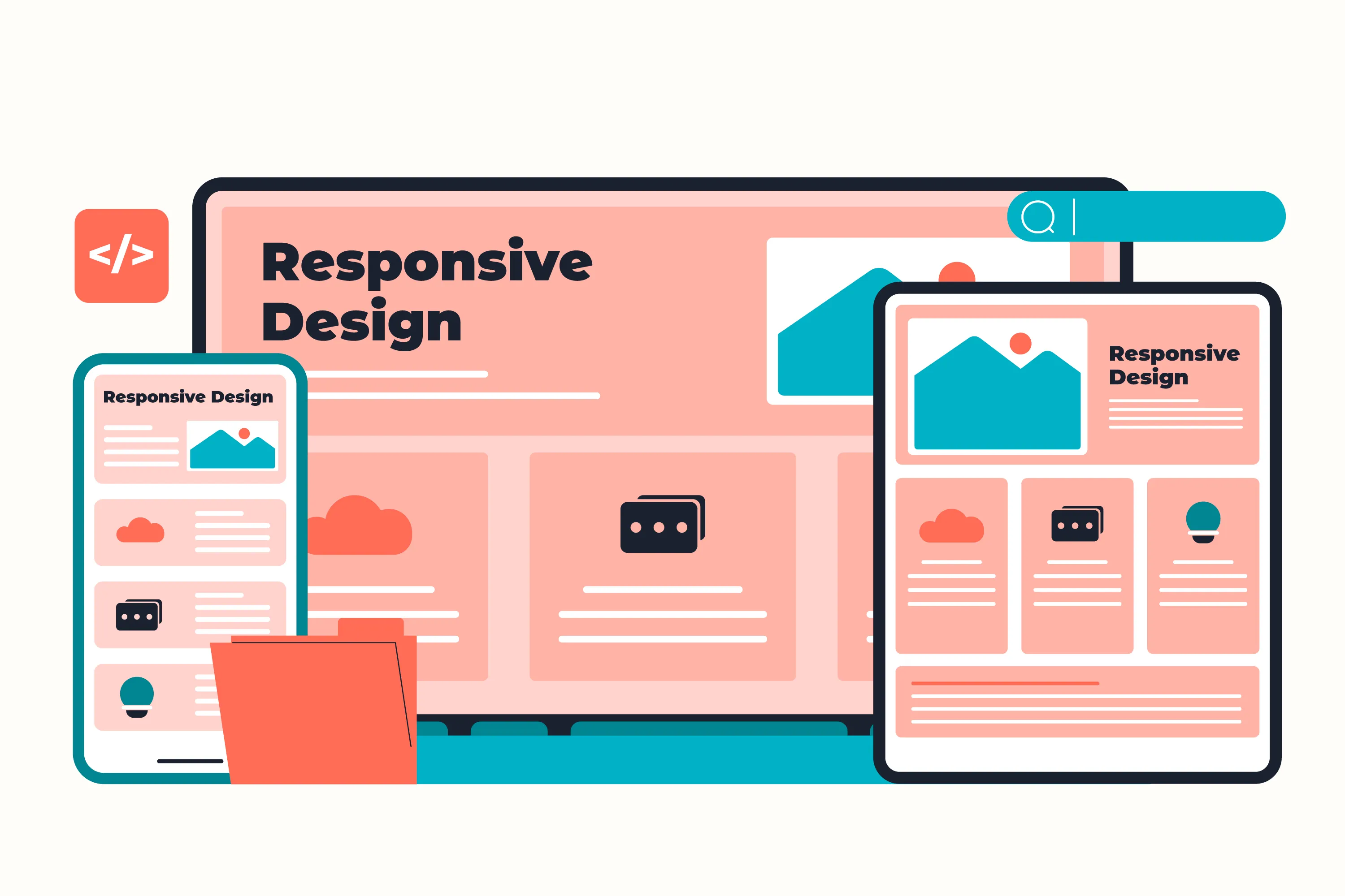
The Responsive Design Definition describes a design concept in which websites are developed in such a way that they automatically adapt to different screen sizes and device types. Regardless of whether a user accesses a website via a large monitor, a tablet or a smartphone — content and content are always displayed optimally.
What is responsive design in everyday life? At its core, it's about the layout, font size, navigation, and images responding flexibly so that no separate desktop version or mobile site is required. Instead of maintaining two separate variants, web designers develop a single, adaptable website that works just as well on all mobile devices as on a classic PC.
Thanks to this concept, access to content remains convenient at all times — regardless of the screen used and the display size.
Why is responsive web design essential for mobile devices today?
User behavior has changed fundamentally in recent years. More and more people are using mobile devices such as smartphones or tablets to surf the Internet while on the go. That is exactly why responsive design is no longer an optional extra, but a must for every professional web project.
Search engines such as Google are now consistently using mobile-first indexing. This means that a page's mobile website is decisive for ranking in search results. If you don't optimize your site for mobile devices, you risk poorer rankings and thus the loss of potential visitors.
User expectations are also increasing: A responsive website must work equally well on every device — whether on a small smartphone, a tablet or a large desktop screen. By using techniques such as viewport adjustments, flexible layouts or relatively defined elements in CSS, the presentation always remains clear and user-friendly.
Professional, responsive web design today means developing a uniform, flexible version of the website right from the start, which automatically adapts to all screen sizes — for a consistently positive user experience.
Benefits of responsive web design for companies
A responsive design like a professional web design agency implements, has numerous advantages for companies. Especially on mobile devices such as tablets and smartphones, an adaptable layout ensures that content is clearly displayed, regardless of the device. Users don't have to zoom or scroll horizontally — this increases usability and significantly reduces bounce rates.
Thanks to responsive web design, the content is smoothly adapted to different screen sizes. Whether it's a small smartphone screen or a large desktop computer — through the targeted use of breakpoints, the layout automatically reacts to the available space. This saves time and costs in development, as there is no need for a separate mobile site or special solutions for different devices.
The advantages are also evident when it comes to maintenance: A single, central system is sufficient to cover all variants of a website. Web design for mobile devices, tablets and classic screens is thus significantly more efficient.
In addition, modern tools and techniques help to make optimal use of the viewport and to make the content adaptive. Adaptive design and responsive design are not mutually exclusive — on the contrary, by combining both approaches, the user experience can be further improved, regardless of device or screen size.
Responsive Design Challenges: Breakpoints & Mobile Adjustments
Even though the benefits are obvious, there are some challenges with responsive web design that companies should consider. In particular, the implementation of a uniform responsive layout for various devices such as mobile devices, tablets or desktop PCs requires technical know-how and precise planning.
A common stumbling block lies in adapting navigation or interactive elements. Menus, buttons, or forms must work just as intuitively on small screens as on large screens. Font sizes also play an important role here: If they are too small or poorly scaled, the user experience suffers significantly.
It is just as important to structure the HTML code cleanly and program it in such a way that the content adapts flexibly. Images and graphics should be optimized for different resolutions to keep load times short, especially on mobile devices.
In addition, a responsive website must be intensively tested on different devices and in different browsers to ensure that the design is displayed correctly everywhere. Close cooperation between web designers and developers in particular is crucial to guarantee a smooth, user-friendly experience for all users.
Best practices for successful responsive web designs: optimization for mobile websites
To develop a truly user-friendly, responsive web design, the Mobile First approach is recommended. The design is initially optimized for small screens and then gradually expanded for larger displays. This ensures that the mobile version of a website works optimally and can later be easily expanded for tablets, laptops or desktops.
An important aspect is the optimization of control elements and content. Buttons and links should be large enough so that they can be easily operated by touch on small displays or in landscape mode. It is also useful to design font sizes and spacing flexibly and to rely on scalable elements that automatically adapt to the available space when reducing or enlarging the browser window.
Especially with responsive navigation, care must be taken to ensure that it remains easily accessible on all devices without impairing clarity. The technical basis for all this is the professional use of media queries and the targeted use of modern technologies such as CSS3, HTML and CSS.
Last but not least, the loading time of the website should also be kept in mind during responsive design. Fast performance and an optimized display on all devices make a significant contribution to increasing user satisfaction and reducing the bounce rate.
Responsive design and UX: two sides of the same coin
Anyone who wants to offer a user-friendly website today comes up with the question “What is responsive web design? “not over. Responsive design is a central part of every successful user experience (UX) strategy. Because only when a page adapts flexibly to different devices can it remain intuitive to use — whether it's a smartphone, tablet or desktop.
Adaptive web design, which uses a defined breakpoint to ensure that layout, navigation and content are dynamically adapted to the screen size and the technical requirements of the respective device, is particularly important. This keeps the user experience pleasant even on small displays, without annoying zooming or endless scrolling.
In practice, this means that web designs that are consistently based on responsive principles offer users a consistently high level of usability on all devices. Anyone who wants to create a professional website today should therefore rely on a well-thought-out, responsive concept right from the start — this noticeably improves user satisfaction and directly contributes to higher retention times and better conversion rates.
How KNGURU successfully implements responsive design for website creation
As an experienced agency, KNGURU uses a holistic approach to develop modern responsive web designs for companies in every industry. The focus is always on optimal presentation on various devices — whether desktop, tablet or smartphone.
Even in the UX and UI phase, our designers make sure to create a well-thought-out, adaptive design. The user interface, content and layout are designed in such a way that the website is convincing on all screen sizes. In the prototyping phase, the first clickable designs are created that can be tested on real devices. In this way, we ensure that the site is intuitive to use, regardless of the mobile device.
In the subsequent technical implementation, we combine modern responsive web design with clean code and high performance. The result: websites that are not only visually convincing, but also work perfectly on mobile devices and offer an excellent user experience.
Conclusion: Responsive design definition and benefits for modern websites
What is responsive design? In short, it is the basis for websites that work optimally on all devices. The Responsive Design Definition describes the flexible design of layouts, images and content. In this way, the display automatically adapts to any screen size, regardless of whether users use a smartphone, tablet or desktop.
Even with small displays with a width of just 600 pixels, a sophisticated responsive design ensures that users experience optimal presentation and full functionality. This ensures ease of use on all devices.
Companies increase the chances of success of their website through satisfied visitors and at the same time reduce effort as separate mobile versions are omitted. If you want to be successful in the long term, you should consistently rely on a well-thought-out responsive design for web development.
knguru
Wir setzen das in echten Projekten um.
100+ projekte eigene App mit 30.000 nutzern
Herausforderungen beim Responsive Webdesign
Natürlich bringt Responsive Design auch einige Herausforderungen mit sich:
- Komplexe Navigation: Menüs müssen auf kleinen Bildschirmen intuitiv funktionieren.
- Performance-Probleme: Große Bilder oder Videos können mobile Ladezeiten verlängern.
- Browser-Kompatibilität: Nicht alle Geräte interpretieren CSS gleich – ausgiebiges Testing ist Pflicht.
Mit cleveren Optimierungen (Lazy Loading, Bildkompression, klare Content-Struktur) lassen sich diese Probleme jedoch leicht lösen.
Responsive Design vs. Adaptive Design
Viele verwechseln Responsive Design mit Adaptive Design, doch es gibt klare Unterschiede:
MerkmalResponsive DesignAdaptive DesignLayoutFlüssig und flexibelMehrere feste LayoutsWartungEinfacherAufwendigerPerformanceOptimierbarVariiert je nach GerätZukunftssicherheitHochMittel
Während Responsive Design dynamisch auf jede Displaygröße reagiert, nutzt Adaptive Design vordefinierte Layouts. Für langfristige Projekte ist Responsive die zukunftssichere Lösung.
Best Practices für Responsive Webdesign
Damit dein responsive webdesign nicht nur technisch, sondern auch optisch überzeugt, solltest du Folgendes beachten:
- Mobile-First-Ansatz: Beginne das Design für kleine Bildschirme und erweitere schrittweise.
- Einfache Navigation: Verwende klare Icons, kurze Menüs und große Touch-Zonen.
- Typografie & Kontrast: Gute Lesbarkeit ist wichtiger als visuelle Effekte.
- Regelmäßige Tests: Prüfe dein Design mit Tools wie Chrome DevTools oder BrowserStack.
- Praxisbeispiele für gelungenes Responsive Design
Große Marken wie Apple, Airbnb oder Spotify zeigen, wie modernes Responsive Design funktioniert:
- Inhalte bleiben klar strukturiert.
- Buttons und Texte passen sich automatisch an.
- Nutzer erleben konsistente Markenästhetik – egal auf welchem Gerät.
Auch kleine Unternehmen profitieren: Eine mobil-optimierte Website wirkt professioneller, steigert Vertrauen und verbessert Conversion Rates.
Fazit
Responsive Webdesign ist längst kein Trend mehr, sondern ein zentraler Bestandteil erfolgreicher Online-Strategien.
Es sorgt dafür, dass deine Website auf jedem Gerät perfekt aussieht, schnell lädt und eine großartige User Experience bietet.
Wer in 2025 online erfolgreich sein möchte, kommt an Responsive Design nicht vorbei.
Investiere in ein modernes, professionelles Design – und mache deine Website fit für jedes Gerät und jede Bildschirmgröße.


Zwischen Agenturalltag und Startup - unser Blog
In unserem Blog teilen wir Tipps rund um das Thema Appentwicklung, Startups und einige verrückte Geschichten aus unserem Agenturalltag mit euch.


Your 30-minute meeting with real experts.
Whether it's an idea or an existing app – we'll tell you honestly where you stand. All of this is free, based on experience from over 100 projects and our own app with 30,000 users. Book your meeting now and get to know us!

Oops! Something went wrong while submitting the form.