
Updated:
May 1, 2025
Published:
May 1, 2025
Web Design Colors: Color Psychology & Color Schemes
Colors in web design are more than mere design elements. They control perspectives, create atmosphere and influence how visitors perceive a website — often unconsciously but effectively. A well-coordinated color scheme helps to clearly structure content, provides orientation and build trust. It's not just about whether a page is designed to be light or dark, but also how colors work together: Harmonious, exciting or targeted in contrast.
Anyone who deals with the meaning of colors quickly comes across color psychology. Colors influence our behavior — they can calm down, inspire, or speed up decision-making processes. For web designers, this means that the choice of color is not a coincidence, but part of the strategy. Especially in marketing, a deliberately chosen color palette can make the difference between success or failure.
Why colors play a central role in web design
Colors speak a language that we understand intuitively — without words. They trigger feelings, raise expectations and influence how visually appealing we find a website. The psychological effect of colors is therefore a central tool in web design: Strong colors can attract attention and create dynamism, while calming and softer colors create trust and promote a pleasant user experience.
Light blue often looks serious and reliable, red can create tension and energy, while muted earthy tones appear down-to-earth and approachable. Brightly placed accents — for example in buttons or call-to-actions — can also steer user behavior in a targeted manner. Brands that are aware of their impact choose their shades carefully: They rely on sophisticated color combinations that underline their identity — whether through elegance, friendliness or clear structure.
Professional companies know that the right colors make the difference — not just in design, but in user behavior. An appealing design starts with a choice of colors that match the brand and consistently carries its message.
Color psychology: What colors trigger in users' minds
Colors often work faster than words — they speak to emotions and form the first impression of a website within seconds. Anyone who works with colors in web design should know which associations they can highlight and how they affect the target group.
Blue stands for trust, competence and security — it is not for nothing that banks, insurance companies and many tech companies such as PayPal or Facebook rely on this color. Red indicates energy, passion, or urgency. It is used specifically to attract attention — for example during discount campaigns or important buttons in e-commerce.
Green is often associated with nature, health and balance. Organic or wellness brands like to use this color. Yellow, on the other hand, appears friendly and optimistic, but can also act as a warning color — depending on saturation and combination. Ikea uses yellow together with blue to convey freshness and accessibility.
Violet stands for creativity, luxury or spirituality and is used by brands such as Milka or Yahoo to visually stand out from competitors. Black and white also have a firm place in web design: While black stands for elegance and strength, white conveys clarity, order and space. Together, they form a strong, classic basis for modern color palettes.
Experienced designers combine these different colors in a targeted manner, depending on the product, industry and target group. The right choice — and placement — often determines whether a user stays or drops out.
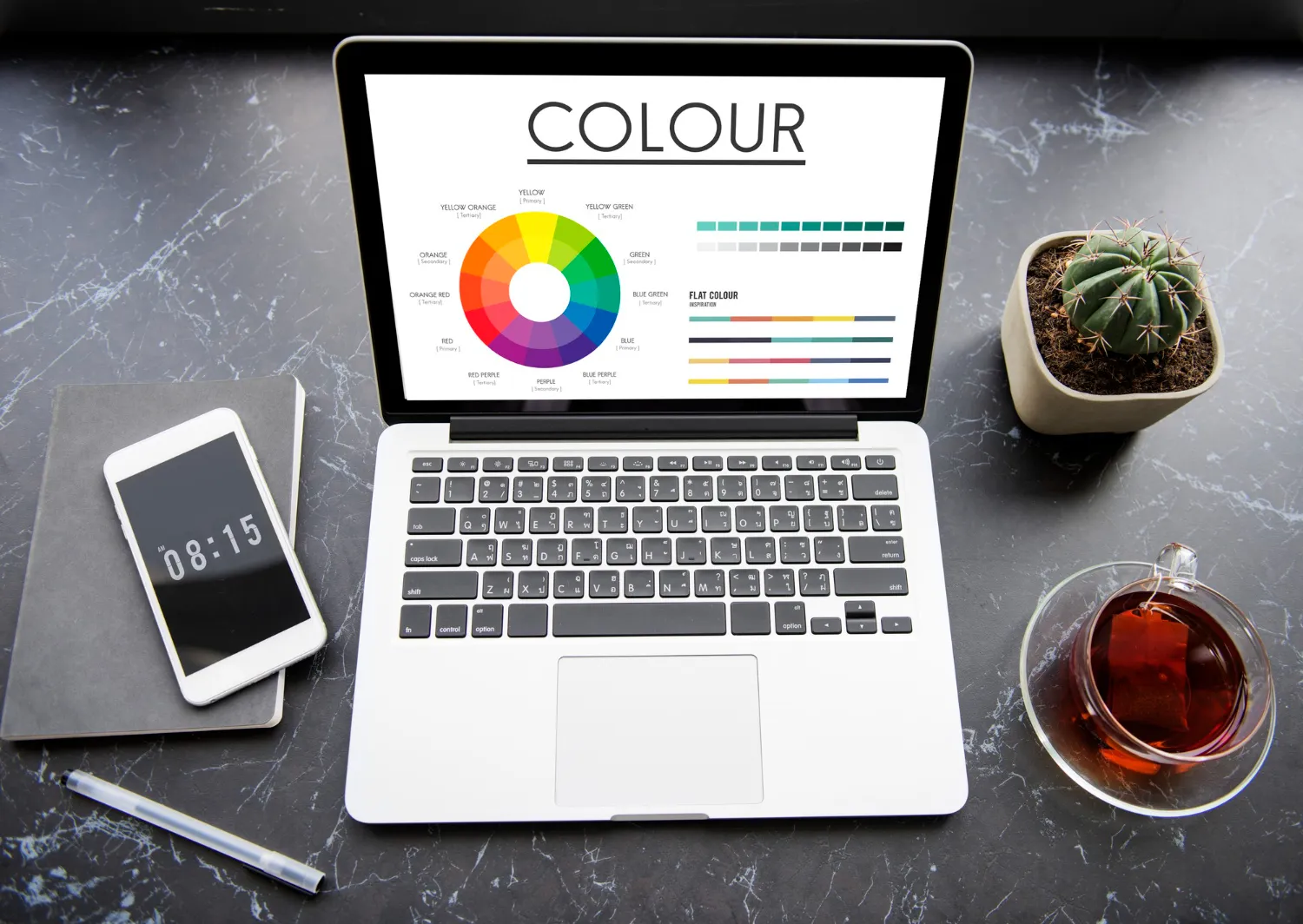
Color harmony and contrast: The key to improved usability
The targeted choice of colors in web design is more than just an aesthetic aspect — it determines how harmonious, functional and accessible a website appears. Color harmony and contrast are two of the most important tools for making content understandable, pleasant and intuitive to understand.
Color harmony — a harmonious interplay for inviting design
A harmonious color combination is created when the individual shades are coordinated and together create a pleasant overall effect. This harmony creates an inviting atmosphere and reinforces the professional impression of the website. Particularly as part of a corporate design, the choice of Colors are crucial: They must not only match the brand, but also function in the digital space. Colors complement each other best when they take on different functions — such as background color, main tone, and accent color — and together form a consistent overall picture.
Popular color schemes in web design include:
- Analogous color schemes: Colors that lie next to each other on the color wheel — such as red, orange, and yellow. They look calm and warm, ideal for friendly and comforting designs.
- Complementary color schemes: Contrasting colors such as blue and orange create strong contrasts and attract targeted attention — e.g. for buttons or call-to-actions.
- Triadic color schemes: Three evenly distributed colors on the color wheel offer a vivid yet balanced look — perfect for creative, dynamic projects.
If you want to choose colors for a website, you should not only pay attention to aesthetics, but also to functionality and target group appeal. Design with saturated colors, achromatic colors, neutral backgrounds and graded tones plays a central role here.
Contrast — for better readability and orientation
Contrast is essential for usability. It not only improves the readability of texts, but also helps to clearly differentiate content from one another. When designing websites, he ensures that users can quickly orient themselves.
Dark text on a light background — or vice versa — is a proven means of clear readability. The contrast between saturated colors and restrained tones also supports the visual hierarchy in design.
Two simple color combinations as an example:
- Warm & inviting (analog):
- salmon pink (e.g. #FFA07A)
- golden yellow (e.g. #FFD700)
- khaki (e.g. #F0E68C)
- Clear & eye-catching (complementary):
- sky blue (e.g. #1E90FF)
- orange-red (e.g. #FF4500)
- white (such as #FFFFFF)
These simple examples show how strongly web design colors can shape user perception — whether through calm balance or targeted accents.
Color palettes and conversion rates: How color selection influences actions
Colors not only influence how a website looks, but also how users act. The right color selection in web design can decide whether someone clicks on a button or leaves the page. Call-to-action elements in particular show how strong colors can have.
Colors like red often trigger urgency — ideal for buttons with calls like “Buy now” or “Save quickly.” Green, on the other hand, is often associated with security, success and positive confirmation, such as when it comes to “add to shopping cart” or “complete order.” Bright colors can also be effective if they are used in a targeted and not overloaded way. The right combination of colors that both stands out and matches the brand identity is crucial.
A/B tests have shown that the color of a button alone can change the conversion rate by several percentage points. In a well-known example, switching from blue to orange during a call-to-action increased the click rate by over 30%. Such results show how much cold and warm colors can differ in their effects.
But be careful: choosing the wrong colors can have the opposite effect. Too bright red on a dark background can be a deterrent, as can a design that is too pale with neutral colors, which allows important elements to disappear. Many colors on a page quickly look restless — a well-coordinated color scheme with clear accents helps here.
The right color combinations in web design create orientation and guide the eye. Those who design consciously combine warm, cold and neutral tones — and test what works for the target group.
Accessibility in web design: making colors tangible for all users
Good web design doesn't just mean aesthetics — it must be accessible to all people. Choosing the right colors plays a central role here. Many users — with poor color vision, for example — find it difficult to distinguish between certain shades of color. A website that conveys information exclusively through color subconsciously excludes it.
Therefore, colors used should always be checked for sufficient contrast — especially for texts, icons or call-to-actions. Light gray text on a white background may look elegant, but is barely legible for many. Anyone developing a color palette for the website should look for suitable colors with good contrast right from the start. Tools such as the Color Contrast Checker (e.g. from WebAIM) help to find barrier-free combinations.
In addition, never communicate just about color. If error messages are shown in red, for example, an icon or text (“Error: Invalid input”) should also be used. In this way, the information remains understandable even for colorblind people.
In practice, this means that the right design is based on a well-thought-out choice of colors, combined with clear structures and complementary visual elements. Making colors particularly accessible means excluding no one — and at the same time improves usability for everyone.
Color trends 2025: What web designers should know now
In 2025, color trends in web design will continue to develop and offer fresh, creative ways to make websites visually appealing and modern. Notable trends include muted shades, which convey a calm and subtle aesthetic, and neo-brutalism, which plays with bold, unpolished colors and robust shapes. In addition, dark mode continues to be a trend that is not only easy on the eyes of users, but also gives it an elegant, modern look.
It is important for web designers to keep up with current color trends, as they can significantly influence the visual impression of a website. Modern designs use colorful accents and dynamic color palettes to improve the user experience. It is crucial to choose the right combination of colors to create a harmonious overall picture that is both aesthetically appealing and functional.
When integrating new trends, web designers should ensure that individual colors are not only visually interesting but also remain user-friendly. For example, muted shades can be used well as backgrounds, while stronger colors are used specifically for call-to-action buttons or important information. This not only keeps the website modern and trendy, but also user-friendly and functional.
In addition, web designers should consider that the Selection of shades harmonizes well with each other. It should not only follow current trends, but also fit the target group and brand identity. A successful web design combines current trends with proven principles of usability and ensures an inviting and professional appearance.
Conclusion: color palette and color combinations for websites
In summary, web design colors are much more than just aesthetic elements — they have a profound emotional impact on user experience. Colors not only influence perception, but also usability, conversion rates, and accessibility of a website. Many websites specifically rely on clear color concepts in order to fully exploit this effect. Through the targeted application of color psychology in web design, web designers can positively steer user behavior and increase interactivity. Different colors and their psychological effects play a decisive role when it comes to trust, urgency or relaxation.
A balanced color concept is therefore not only decisive for the visual appearance of a website, but also for effectiveness and success. Even with just two colors, a strong effect can often be achieved if they are used in a contrasting and functional way. More complex designs, on the other hand, work with three or four colors, which are harmoniously coordinated and take on different roles in the layout. The right color combinations for websites can help create a harmonious, user-friendly, and appealing atmosphere. If you choose the colors of a website well and complement them cleverly, you ensure that the creation of a website not only looks beautiful, but also meets its goals.
If you want to strategically use your colors in web design to create an even more effective and user-oriented website, I invite you to consult KNGURU. Our web design agency For UX/UI design, use targeted color psychology to increase your success and achieve the desired results.
knguru
Wir setzen das in echten Projekten um.
100+ projekte eigene App mit 30.000 nutzern
Farbpaletten und Conversion Rates: Wie Farbauswahl Handlungen beeinflusst
Farben beeinflussen nicht nur, wie eine Website aussieht, sondern auch, wie Nutzer:innen handeln. Die richtige Farbauswahl im Webdesign kann darüber entscheiden, ob jemand auf einen Button klickt oder die Seite verlässt. Besonders bei Call-to-Action-Elementen zeigt sich, wie stark Farben wirken können.
Farben wie Rot lösen oft Dringlichkeit aus – ideal für Buttons mit Aufrufen wie „Jetzt kaufen“ oder „Schnell sichern“. Grün hingegen wird häufig mit Sicherheit, Erfolg und positiver Bestätigung assoziiert, etwa bei „Zum Warenkorb hinzufügen“ oder „Bestellung abschließen“. Auch bunte Farben können effektiv sein, wenn sie gezielt und nicht überladen eingesetzt werden. Entscheidend ist die richtige Kombination von Farben, die sowohl auffällt als auch zur Markenidentität passt.
A/B-Tests haben gezeigt, dass allein die Farbe eines Buttons die Conversion Rate um mehrere Prozentpunkte verändern kann. In einem bekannten Beispiel steigerte ein Wechsel von Blau zu Orange bei einem Call-to-Action die Klickrate um über 30 %. Solche Ergebnisse zeigen, wie stark kalte und warme Farben in ihrer Wirkung voneinander abweichen können.
Doch Vorsicht: Die Wahl der falschen Farben kann das Gegenteil bewirken. Ein zu grelles Rot auf dunklem Hintergrund kann abschrecken, ebenso wie eine zu blasse Gestaltung mit neutralen Farben, die wichtige Elemente untergehen lässt. Viele Farben auf einer Seite wirken schnell unruhig – hier hilft ein gut abgestimmtes Farbschema mit klaren Akzenten.
Die richtigen Farbkombinationen im Webdesign schaffen Orientierung und führen den Blick. Wer bewusst gestaltet, kombiniert gezielt warme, kalte und neutrale Töne – und testet, was bei der Zielgruppe funktioniert.
Barrierefreiheit im Webdesign: Farben für alle Nutzer erlebbar machen
Gutes Webdesign bedeutet nicht nur Ästhetik – es muss für alle Menschen zugänglich sein. Dabei spielt die Wahl der richtigen Farben eine zentrale Rolle. Viele Nutzer:innen – etwa mit Farbsehschwächen – können bestimmte Farbtöne nur schwer unterscheiden. Eine Website, die Informationen ausschließlich über Farbe vermittelt, schließt sie unbewusst aus.
Deshalb sollten verwendete Farben stets auf ausreichenden Kontrast geprüft werden – besonders bei Texten, Icons oder Call-to-Actions. Ein hellgrauer Text auf weißem Hintergrund mag edel wirken, ist aber für viele kaum lesbar. Wer eine Farbpalette der Website entwickelt, sollte von Anfang an auf passende Farben mit gutem Kontrast achten. Tools wie der Color Contrast Checker (z. B. von WebAIM) helfen dabei, barrierefreie Kombinationen zu finden.
Außerdem gilt: Nie nur über Farbe kommunizieren. Wenn Fehlermeldungen z. B. rot dargestellt werden, sollte zusätzlich ein Symbol oder ein Text („Fehler: Ungültige Eingabe“) verwendet werden. So bleibt die Information auch für farbenblinde Menschen verständlich.
In der Praxis heißt das: Das richtige Design setzt auf durchdachte Farbwahl, kombiniert mit klaren Strukturen und ergänzenden visuellen Elementen. Farben besonders zugänglich zu gestalten, bedeutet, niemanden auszuschließen – und verbessert ganz nebenbei die Usability für alle.
Farbtrends 2025: Was Webdesigner jetzt wissen sollten
Im Jahr 2025 entwickeln sich die Farbtrends im Webdesign weiter und bieten frische, kreative Möglichkeiten, um Websites visuell ansprechend und modern zu gestalten. Zu den bemerkenswerten Trends gehören gedämpfte Farbtöne, die eine ruhige und subtile Ästhetik vermitteln, sowie der Neobrutalismus, der mit kräftigen, unpolierten Farben und robusten Formen spielt. Zudem ist der Dark Mode weiterhin ein Trend, der nicht nur die Augen der Nutzer schont, sondern auch einen eleganten, modernen Look verleiht.
Für Webdesigner ist es wichtig, mit den aktuellen Farbtrends Schritt zu halten, da sie den visuellen Eindruck einer Website erheblich beeinflussen können. Moderne Designs setzen auf farbige Akzente und dynamische Farbpaletten, um die Nutzererfahrung zu verbessern. Dabei ist es entscheidend, die richtige Kombination der Farben zu wählen, um ein harmonisches Gesamtbild zu schaffen, das sowohl ästhetisch ansprechend als auch funktional ist.
Bei der Integration neuer Trends sollten Webdesigner darauf achten, dass einzelne Farben nicht nur visuell interessant sind, sondern auch benutzerfreundlich bleiben. Beispielsweise können gedämpfte Farbtöne gut als Hintergründe genutzt werden, während kräftigere Farben gezielt für Call-to-Action-Buttons oder wichtige Informationen eingesetzt werden. So bleibt die Website nicht nur modern und trendy, sondern auch benutzerfreundlich und funktional.
Zusätzlich sollten Webdesigner berücksichtigen, dass die Auswahl von Farbtönen gut miteinander harmoniert. Sie sollte nicht nur aktuellen Trends folgen, sondern auch zur Zielgruppe und Markenidentität passen.. Ein gelungenes Webdesign kombiniert aktuelle Trends mit bewährten Prinzipien der Usability und sorgt für ein einladendes und professionelles Erscheinungsbild.
Fazit: Farbpalette und Farbkombinationen für Websites
Zusammenfassend lässt sich sagen, dass Webdesign Farben weit mehr sind als nur ästhetische Elemente – sie haben einen tiefgreifenden emotionalen Einfluss auf die Nutzererfahrung. Farben beeinflussen nicht nur die Wahrnehmung, sondern auch die Usability, Conversion-Raten und die Barrierefreiheit einer Website. Viele Websites setzen gezielt auf klare Farbkonzepte, um diese Wirkung voll auszuschöpfen. Durch die gezielte Anwendung von Farbpsychologie im Webdesign können Webdesigner das Verhalten der Nutzer positiv lenken und die Interaktivität steigern. Dabei spielen verschiedene Farben und ihre psychologischen Wirkungen eine entscheidende Rolle, wenn es um Vertrauen, Dringlichkeit oder Entspannung geht.
Ein ausgewogenes Farbkonzept ist also nicht nur für das visuelle Erscheinungsbild einer Website entscheidend, sondern auch für die Effektivität und den Erfolg. Schon mit zwei Farben lässt sich oft eine starke Wirkung erzielen, wenn sie kontrastreich und funktional eingesetzt werden. Komplexere Designs arbeiten dagegen mit drei oder vier Farben, die harmonisch aufeinander abgestimmt sind und unterschiedliche Rollen im Layout übernehmen. Die richtigen Farbkombinationen für Websites können dabei helfen, eine harmonische, benutzerfreundliche und ansprechende Atmosphäre zu schaffen. Wer die Farben einer Website gut auswählt und geschickt miteinander ergänzt, stellt sicher, dass die Erstellung einer Website nicht nur schön aussieht, sondern auch ihre Ziele erfüllt.
Wenn du deine Farben im Webdesign strategisch einsetzen möchtest, um eine noch effektivere und benutzerorientierte Website zu gestalten, lade ich dich ein, KNGURU zu konsultieren. Unsere Webdesign Agentur für UX/UI Design nutzen gezielt Farbpsychologie, um deinen Erfolg zu steigern und die gewünschten Ergebnisse zu erzielen.


Zwischen Agenturalltag und Startup - unser Blog
In unserem Blog teilen wir Tipps rund um das Thema Appentwicklung, Startups und einige verrückte Geschichten aus unserem Agenturalltag mit euch.


Your 30-minute meeting with real experts.
Whether it's an idea or an existing app – we'll tell you honestly where you stand. All of this is free, based on experience from over 100 projects and our own app with 30,000 users. Book your meeting now and get to know us!

Oops! Something went wrong while submitting the form.