
Updated:
November 15, 2025
Published:
November 15, 2025
App icon design: This is how your app stands out in 2025
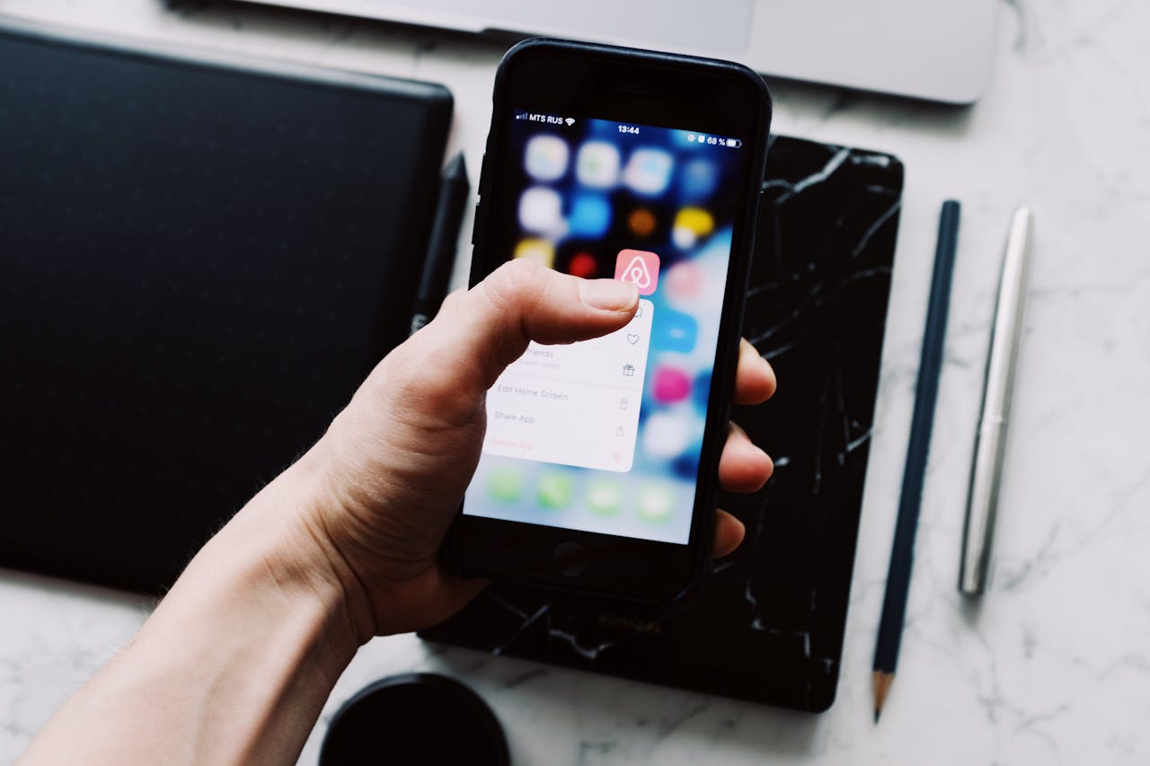
The app icon is the first thing users see of your app—even before they know what to expect. It often determines whether someone clicks on “Install” in the App Store or continues to scroll. A strong app icon design can therefore make the difference between an average and a successful app launch.
In this article, you'll learn how to create an app icon that looks professional, evokes emotions, and stands out from the crowd. We'll also show you the best tools, design principles, and common mistakes to avoid.
Why a strong app icon design is crucial
An app icon is much more than just an icon — it's the face of your brand. Users make visual decisions in fractions of a second, and a good icon can radiate trust, quality, and professionalism.
A successful app icon design:
- makes your app instantly recognizable
- conveys brand identity,
- awakens curiosity and emotions,
- and ensures a higher click rate in the App Store.
Color, shape and contrast play a decisive role here. Studies show that apps with clear, consistent icons are downloaded up to 25% more often than apps with unclear designs.
Basics of a successful app icon
A good app icon must do three things: It should be simple, memorable, and scalable.
Avoid too many details — fine lines and fonts are quickly lost on small displays. Instead, focus on a clear, strong shape and a color palette that matches your app's style.
Examples of successful icons:
- Instagram — simple yet concise color gradients
- WhatsApp — clear contrast, symbol as brand anchor
- Duolingo — likeable figure with high recognition value
A good app icon remains recognizable even if it is only 50 × 50 pixels in size.
Design principles and best practices
If you're creating your own app icon design, these proven principles will help you:
- Simplicity: Use clear shapes and minimalistic design.
- color: Choose a maximum of two to three colors — they should convey emotions (e.g. blue = trust, green = growth).
- Consistency: Your icon should match your app UI and branding—just like in a professional UX/UI design.
- Platform guidelines: Follow the Apple Human Interface Guidelines and Google Material Design.
- Frames & Shadows: Subtle depth and shadow effects can help make the icon look more vivid.
Tip: Test your icon on different backgrounds (light, dark, colorful) to make sure it looks good everywhere.
App icon design tools and resources
You don't need a huge design team to create a professional icon. These tools help you work visually — often for free:
- Figma — perfect for collaboration and precise layouts.
- Adobe Illustrator — ideal for scalable vector graphics.
- Sketch — designed specifically for app designers.
- Canva — beginner-friendly with templates.
- Lunacy — free alternative with professional features.
Many designers start with a grid or icon grid to maintain symmetry and balance. Test your icon in various sizes — a step that many underestimate.
App icon sizes and guidelines for iOS & Android
To ensure that your icon is displayed optimally in all stores and on all devices, you should follow the official sizing guidelines:
Make sure you export your app icon in multiple resolutions to keep it sharp on all displays.
Common mistakes in app icon design
Even good ideas often fail when implemented. Here are the most common mistakes — and how to avoid them:
- Too many details: Small icons need clear shapes, not illustrations.
- Inappropriate colors: Pay attention to accessibility and contrasts.
- Not related to the app: The icon should reflect the core of your app.
- Not tested: Icons look different depending on the device and background.
Pro tip: Compare your icon with similar apps directly in the App Store — this is how you can see if it really stands out.
How to test your app icon
Before you officially release your icon, you should test it:
- A/B testing on Google Play Store or via TestFlight (iOS) is ideal for comparing different designs.
- User surveys help to measure emotions and recognizability.
- Prototyping tools such as Figma or Adobe XD enable quick visual testing.
Even small design changes — such as slightly changed color gradients — can result in significant differences in download rates.
When rebranding makes sense
Sometimes an existing app icon also needs an update. Reasons could be a new branding, a design modernization, or a UI overhaul.
If you're modernizing your app anyway, a new icon can be a strong signal for the relaunch. In such cases, working with a professional partner is worthwhile for app developmentto perfectly match icon, interface and brand identity.
conclusion
A successful app icon design is clear, recognizable and conveys the identity of your app at first glance.
Use colors, shapes, and consistency to stand out from the crowd — and test different variants before you go live.
Whether you're doing it yourself or working with a design team, a strong app icon is the first step to making your app visible and unmistakable.
knguru
Wir setzen das in echten Projekten um.
100+ projekte eigene App mit 30.000 nutzern
App Icon Größen und Richtlinien für iOS & Android
Damit dein Icon in allen Stores und auf allen Geräten optimal dargestellt wird, solltest du die offiziellen Größenrichtlinien beachten:
Achte darauf, dass du dein App Icon in mehreren Auflösungen exportierst, damit es auf allen Displays scharf bleibt.
Häufige Fehler beim App Icon Design
Selbst gute Ideen scheitern oft an der Umsetzung. Hier sind die häufigsten Fehler – und wie du sie vermeidest:
- Zu viele Details: Kleine Icons brauchen klare Formen, keine Illustrationen.
- Unpassende Farben: Achte auf Barrierefreiheit und Kontraste.
- Kein Bezug zur App: Das Icon sollte den Kern deiner App widerspiegeln.
- Nicht getestet: Icons wirken je nach Gerät und Hintergrund unterschiedlich.
Pro-Tipp: Vergleiche dein Icon direkt im App Store mit ähnlichen Apps – so erkennst du, ob es wirklich heraussticht.
Wie du dein App Icon testest
Bevor du dein Icon offiziell veröffentlichst, solltest du es testen:
- A/B-Tests im Google Play Store oder über TestFlight (iOS) sind ideal, um verschiedene Designs zu vergleichen.
- Nutzerumfragen helfen, Emotionen und Wiedererkennbarkeit zu messen.
- Prototyping-Tools wie Figma oder Adobe XD ermöglichen schnelle visuelle Tests.
Selbst kleine Designänderungen – etwa leicht veränderte Farbverläufe – können signifikante Unterschiede in der Downloadrate bewirken.
Wann ein Rebranding sinnvoll ist
Manchmal braucht auch ein bestehendes App Icon ein Update. Gründe können ein neues Branding, eine Designmodernisierung oder eine UI-Überarbeitung sein.
Wenn du deine App ohnehin modernisierst, kann ein neues Icon ein starkes Signal für den Relaunch sein. In solchen Fällen lohnt sich die Zusammenarbeit mit einem professionellen Partner für App-Entwicklung, um Icon, Interface und Markenidentität perfekt aufeinander abzustimmen.
Fazit
Ein gelungenes App Icon Design ist klar, wiedererkennbar und transportiert die Identität deiner App auf den ersten Blick.
Nutze Farben, Formen und Konsistenz, um aus der Masse herauszustechen – und teste verschiedene Varianten, bevor du live gehst.
Ob du selbst Hand anlegst oder mit einem Designteam arbeitest: Ein starkes App Icon ist der erste Schritt, um deine App sichtbar und unverwechselbar zu machen.


Zwischen Agenturalltag und Startup - unser Blog
In unserem Blog teilen wir Tipps rund um das Thema Appentwicklung, Startups und einige verrückte Geschichten aus unserem Agenturalltag mit euch.

Your 30-minute meeting with real experts.
Whether it's an idea or an existing app – we'll tell you honestly where you stand. All of this is free, based on experience from over 100 projects and our own app with 30,000 users. Book your meeting now and get to know us!

Oops! Something went wrong while submitting the form.